039. Chromatic Reliquary
For this month’s letter, a prismatic saturation to shake you out of winter’s dullness, to distract you from the violence and sadness that makes the world feel colorless.
Hello friends,
February is such a peculiar month. Sure, Valentine’s Day brings a bit of warmth with it, but the rest of these shortened days can be so utterly slate gray and dreary, wet like leftover snow slushed with pollution and exhaust. So, of course, I reach for color wherever I can find it, what I see, what I wear, colors evoked by what I taste or listen to, chasing ephemeral bursts of vibrancy.
I’m thinking about how, as the use of stained glass was incorporated into medieval church design, the goal was not to create windows that people could look out and see the outside, but rather to let the light in to control it, to tell stories through the sensorial divine.
For this month’s letter, a prismatic saturation to shake you out of winter’s dullness, to distract you from the violence and sadness that makes the world feel colorless.
TOUCH
I’ve been recommending Prismatic Ecology: Ecotheory Beyond Green for years now, and it still remains one of my favorite collections of essays. Featuring essays that quite literally cross the spectrum from white to red to ultraviolet and all across wildernesses and built environments, the contributors in this book link color to elements of flora and fauna (like suburban lawns, x-rays, and oranges) in ways that disrupt our understanding of how we, as humans, relate to the natural world. As editor Jeffrey Jerome Cohen writes in his introduction, “No woodland is monochrome.”
At the start of the year, I went and saw Jennifer Packer’s exhibition at the Whitney and was absolutely amazed by her gorgeous paintings. I was completely drawn in to her style of abstracted portraiture. These intimate pictures of family and friends are both visible and opaque to the viewer, with Packer’s brush strokes and washes of color piecing together slivers of bedrooms, apartments, plants, and ephemera, sharing with us little pieces of their lives without ever fully revealing their stories to us. One work that lingered in my mind long after I left was the 2020 painting, Blessed Are Those Who Mourn (Breonna! Breonna!), pictured above.
Every time I wear this scarf designed by artist Colette Bernard, I know I’m going to get compliments wherever I ago. How can you not, when this scarf and its whimsical pattern of rainbows and flowers brights up even the coldest, most miserable winter days. Each time I put it on, I feel myself perk up a little bit and it’s a great reminder that spring is just around the corner. I’ve followed Colette for a while now, and recommend you support her by checking out her TikTok where she posts videos about her creative process and navigating the craziness of the art world, as well picking up some of her artwork and designs through her shop.
David Batchelor’s Chromophobia is a fascinating look at the way Western culture and intellectual production has emphasized the eradication of color. Beginning with an observation about the aggressively white walls of a house he visits for a party, Batchelor considers what he calls ‘chromophobia,’ a fear of contamination through color by taking us through a historical look at this process dating all the way back to Ancient Greece. Batchelor notes that color, and its potential for corruption, has been coded as feminine, vulgar, childish, non-Western (inferior to the values of Western society). He writes, “Color is a lapse into decadence and a recovery of innocence, a false addition to a surface and the truth beneath that surface. Color is disorder and liberty; it is a drug, but a drug that can intoxicate, poison or cure. Color is all of these things, and more besides, but very rarely is color just neutral.”
LOOK
I was first introduced to Caitlin Cherry’s work at the launch of Legacy Russell’s book Glitch Feminism then got the chance to see her vibrant paintings in person at her 2020 exhibition at The Hole. Cherry’s compositions entangle bodies and digital spaces, depicting dancers, influencers, and sex workers she’d find scrolling through Instagram through through kaleidoscopic portraiture. Each of Cherry’s paintings act like a desktop, accumulating icons of Internet culture (like images of gamers streaming) to explore the way Black femininity has been commodified and fetishized in today’s digital culture and can be a site of agency and empowerment. She says in an interview with 032c, “I really fight to create paintings that archive the images that we see so much in popular culture, but that don’t often register as ‘worthy’…”
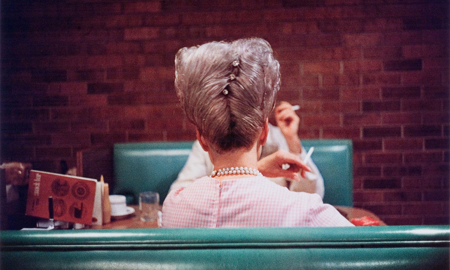
I couldn’t do a letter about color without mentioning photographer William Eggleston. Dubbed a pioneer of color photography, Eggleston’s images are electrifying and mundane at the same, making slices of everyday life with a richness of color that makes gas stations, storefronts, and people around Memphis into something cinematic. Eggleston’s style is something we take for granted today, with many photographers adopting similar techniques and preferences for saturation, so it’s crazy to think that his 1976 MoMA solo show was derided by critics and fine art photographers also had a disdain for his rejection of black and white (Eggleston recalls Henri Cartier-Bresson telling him, “You know, William, color is bullshit.”). I had such a hard time finding an image for this section because there are too many that I love, but this diner photograph I saw at his 2018 exhibition at The Met still haunts me.
Tae Lee’s painting practice takes inspiration from the New Age psychedelia of the 60s and 70s and Buddhist explorations of consciousness, creating such eye-catching compositions that feel like something out of a fairytale. I really love the way that her paintings have this radiating glow to them, using abstracted shapes and neon hues to tell stories of myth and magic with wondrous feeling and warm divinity.
Known as @tinycactus, KangHee Kim’s photographs are surreal, escapist transformations of the everyday, with collaged manipulations that bring dazzling skies and landscapes into urban and domestic settings. I’ve been drawn to her ongoing series, Street Errands, since it began in 2016. These scenes, made from images she’d take while living in New York and where' she’s travelled in the United States, have a playful atmosphere to them as they defy reality. Because Kim is unable to leave the U.S. due to her DACA status, these manipulated photos offer a way to transform and move beyond the conditions of her reality to enter fantastical new spaces.
LISTEN
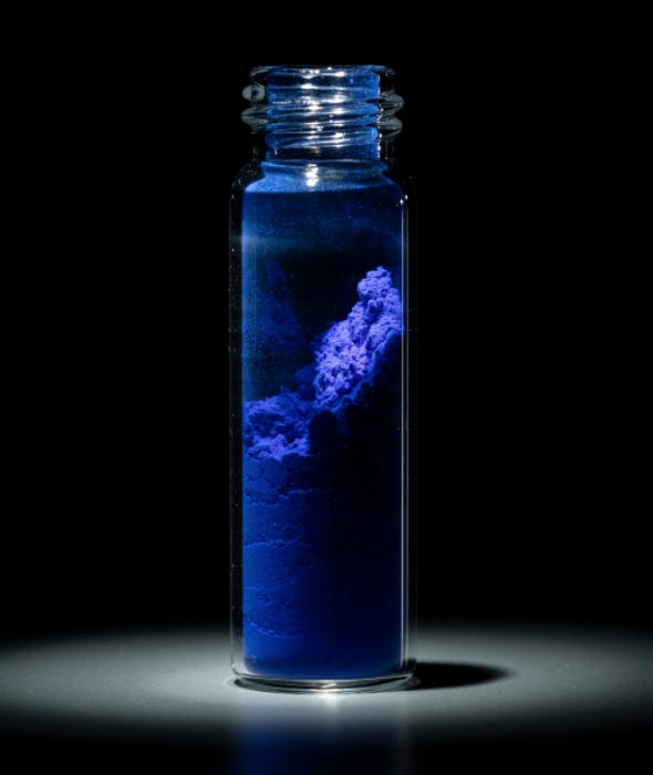
The discovery of YInMn Blue by Professor Professor Mas Subramanian and (then) graduate student Andrew E. Smith in 2009 was, like many scientific discoveries, an accident. YInMn Blue became the first the first inorganic blue pigment found in the past 200 years, and I love how this episode of Overheard at National Geographic takes a look at how this new color was uncovered. Because YInMn Blue was going to be featured in a magazine story about the history of pigments, the episode takes listeners into National Geographic’s photo studios to get a behind-the-scenes look at the challenges of capturing this vibrant new hue and bringing it to the printed page.
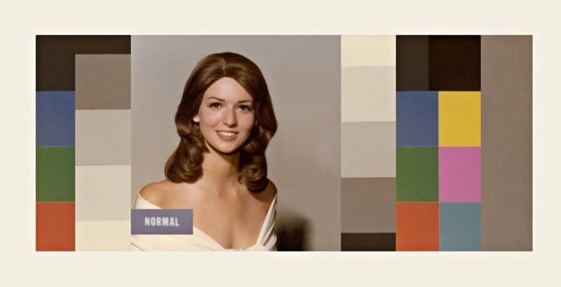
99% Invisible took a look at Shirley Cards in a recent episode, telling the forgotten history of these visual tools in the development of film and photography that still impact the way we look at images and video today. As Kodak’s photo development business grew, they developed Shirley Cards, named after model and Kodak employee Shirley Page, to send to photo labs in order to calibrate their printers with accurate color swatches. With only white women being used as standard references, however, images of people with darker skin tones ended up being printed inaccurately since the film and its development process was optimized for white skin. Although Kodak would later adjust its products, Shirley Cards are a striking example of the way racism can permeate the structures of everyday life and culture, so I urge you to listen to this fascinating history.
LICK
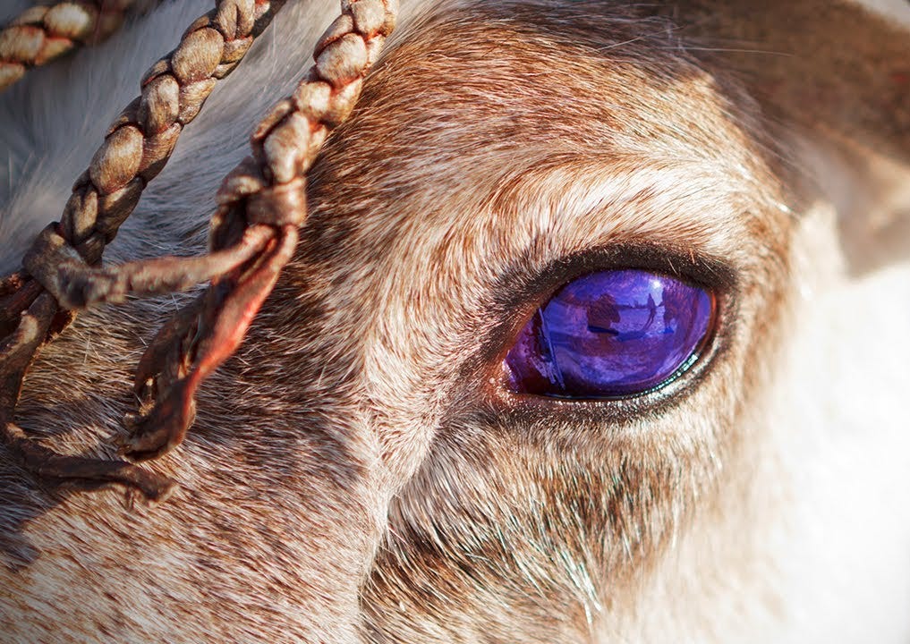
One of my favorite animal facts is that reindeers’ eyes change color throughout the season. Yeah, you read that right. I’m going to try to avoid getting to far in the animal anatomy weeds here, but this effect (which takes eyes from a golden yellowy brown in the summer to a dark blueish violet in the winter) is all thanks to a layer of tissue called the tapetum lucidum. This part of the eye causes that glow effect you’ll see in other animals who navigate through low light, like cats, and it helps reindeer see better during the long, dark days of Arctic winter. The color change itself is believed to be caused by their pupils staying wide open during the winter to let in more light, causing pressure on the collagen fibers of the tapetum lucidum. This adaptation gives reindeer the ability to see in near total blackness, like built-in night vision goggles.
Ravyn Lenae’s music video for her song “Sticky” is a disco-infused fever dream. I love the way the set is built with translucent colored panels, letting flashes of light and color bounce off the sequins and glitter adoring her and her dancers as the camera swings through an electric, retro haze.
I first learned about Tilke Elkins’s Wild Pigment Project when they shared Julie Beeler’s Mushroom Color Atlas, a great online resource that catalogs colors produced by different species of fungi. Wild Pigment Project connects anyone interested in wild pigments with practitioners and educational tools to build their expertise in this field, all with an emphasis on land and cultural stewardship. Artists, ecologists, foragers, soil and geological researchers, Indigenous cultural practitioners, and conservators can all access Wild Pigment Project’s directory of ‘pigment people’ to learn more about pigment practices and exchange knowledge across disciplines. You can spend hours diving into their resources and check out their online exhibit, too.
CLICK
I continue to be so fascinated by Harvard Art Museum’s Forbes Pigment Collection. This unique collection is a conservator’s paradise, with over 2,700 samples of pigments. Unlike other archival collections, the Forbes Pigments are in constant use by museums and conservation scientists who use these pigments as samples for lab testing. It’s an essential collection, breaking down the paints and pigments used to create the world’s most revered artworks down to a rich spectrum of precious hues.
I’ll end this letter with a poem, as I always love to do. This time it’s “Colors passing through us” by Marge Piercy. Condensing the electrifying wonder of the rainbow into a few explosive stanzas, Piercy brings the beauty of the world lovingly into the body’s emotional core. She writes, “Every day I will give you a color, / like a new flower in a bud vase / on your desk.”
Thanks for taking the time to read! Feel free to share this little project of mine with your friends, lovers, and enemies. If you like what I do, you can help feed my leopard gecko through Ko-Fi or check out my website to find more of my writing. You can find a list of books by the people I mentioned on Bookshop (I get a small commission through this and any other affiliate links in this letter).
Until next time,
Ellie


